|

Grayson Perry "ISMS"
Paul Scott: "The
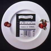
Accuracy of Artillery, Radar Produce of Israel"
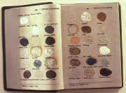
Lenny Goldenberg:
"Glaze Book"
Karen Densham"
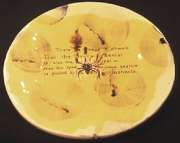
Spider 1998"
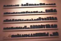
Janet Williams"Babel
Books 1998", (Fired books)
|
Words
are increasingly making their mark on contemporary
studio ceramics. Along with printed surfaces and
figurative forms and decoration, words are part of a
postmodern drive to give ceramics more meaning and
accessibility. These aims should be particularly
facilitated by applying words to ceramic surfaces. The
universalising modernist argument however, would point
to indigenous language differences curtailing these very
intentions and restricting potential audiences just as
the self-referential language of most studio ceramics
excludes the uninitiated. Ceramics bearing words, though
apparently reverting to a comparative vernacular, at
least say something new, unlike the lingua franca
of much mainstream studio pottery which declaims empty
platitudes or endlessly repeats stale cliches.
Insistence
on function, harmony of form and decoration, the
expressive touch rather than the expression of thought,
have long suppressed words as extraneous to the studio
potter's creative language. (1) The
common currency of communication, words are seemingly at
odds with the refined aesthetics, specialised technical
skills and forging of personal visual vocabularies
expected of the serious ceramist. Words belong on
mass-produced souvenir and commemorative ware, on dog
bowls and jokey mugs, and these associations make
traditionalists view their incursion into studio
ceramics as deeply subversive and antithetical to the
dumb eloquence of its most revered creations.
The
exhibitors in Glazed Expressions - more concerned
with relevance than reverence - use words in defiance of
the orientalist, rural or cool design values which have
characterised studio ceramics but precluded engagement
with the everyday imagery and issues of Western urban
society. Today's ceramists might be seen as responding,
somewhat belatedly, to the phenomenal prominence of
words seen in fine art over the last four decades.
Sixties pop art first gave unprecedented visibility to
words in reflecting popular printed material and
mass-produced commodities. Later in the decade,
Conceptual art began to marginalise images and objects
to divert attention to ideas presented increasingly as
documentation and text. Theory, semantics, and the
critique of art itself flourished - as art. From the
1970s, feminist and political art added polemical texts
and provocative word/image alliances, and in the l980s
and 90s post modernist strategies of appropriation,
parody and ironic juxtaposition have added to the
word-count.
Inevitably
these currents, and the cultural and political climate
which shaped them, have impacted on ceramics. The use of
words in ceramics has gained momentum in Britain over
the last decade, developed by specialist potters and
artists from other disciplines wanting to express ideas
whose meaning depends entirely on this precise
combination. (2) Not all 'craft'
mediums have a technical and traditional basis which
allows words to be given an importance parallel to that
demonstrated by fine art. Clay though is uniquely
flexible, and is able to both respond to tendencies in
fine art and develop a conceptual language based on Its
own inherent properties and on the history and
traditions of ceramics, high and low - the mass-produced
and individual, the functional and decorative.
Over the
centuries words have been inscribed or printed on
ceramics as documentary and narrative texts; in
religious exhortations and quotations; in burlesque and
ribald verse; in moral and political messages. In some
cases slippery semantics were celebrated - puns were
inscribed on 19th century plates and tobacco jars -
underscoring the infinite malleability of both clay and
words. The two also enjoy a very ancient partnership
which firmly associates ceramics with vehicles for
conveying meaning as much as with vessels for containing
matter. It has been noted that: 'What the book is to
history, the pot is to prehistory... through the first
clay tablets of four and a half thousand years ago, the
pot and the book (share) a common geological
ancestry...' (3)
Ancient
Babylonians and Assyrians inscribed and impressed
writing into tablets of soft clay, oven-baked or
sun-dried. These flat tablets, inscribed on both sides,
numbered and laid out in sequence on shelves, anticipate
the familiar book form perhaps more closely than the
handwritten papyrus scrolls commonly identified as its
precursor. It is therefore probably not purely
coincidental that the book - the archetypal container
for words - is one of the most common objects replicated
or referenced in ceramics.
An early
example by Robert Arneson, Earth Book 1 (1973)
makes the geological connection but is also inscribed
with the title Secret Ceramic Glazes satirising
the technical obsessions and recipe retention associated
with potters - the glazes remain secret as the 'book'
cannot be opened. Another American, Richard Shaw,
includes books in many of his hyperrealist photo-silkscreened
porcelain object groups. Here they can be interpreted as
emblems of the 'literal', which itself can be defined as
close to the written word, as suggesting absolute
accuracy (which is appropriate to the detailed
simulations of Shaw's work) and as implying veracity
(which given the deceptive nature of his pieces, is
highly ironic).
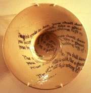
The
closed books of Arneson and Shaw conceal content whereas
Lenny Goldenberg uses the device of the open book to
reveal its extraordinary reductive capacity as a vessel
for information distilled into words. Goldenberg's
recent series of press-moulded books often continues
impressed text and captions with three-dimensional
representations of the content projecting from the
surface. In Throwing on the Wheel Handbook the
text describing the steps in the process is
'illustrated' by sculptural hands which progressively
extrude the clay pot from the clay page - recalling
their ancient affinities The basic form of Goldenberg's
books also recalls mass-produced examples such as china
bible ornaments 'open' at the Lord's Prayer.
The
conjunction of allusions to the archaic and the
mass-produced also appears In works which relate
technically and thematically to the newspaper industry,
which daily generates billions of words. A number of
ceramists (including Goldenberg) have adapted the
industry's technology to impress words or whole texts -
where the ephemeral, expendable nature of newsprint
words act as reminders to the more enduring ones
impressed on ancient clay tablets. The primal link
between clay and words continues to develop in ways
which relate to late 20th century experience. A recent,
highly successful, teaching method for dyslexics
involves modelling clay words along with clay images of
the words' meanings based on dictionary definitions.
This enables dyslexics to make sense of the abstract
symbols of the alphabet, and reverses the role of the
ancient clay tablets which were impressed not with the
sub-imagery of hieroglyphs or pictographs but the
abstract code of cuneiform - the earliest written words.
(4)
This
palaeographic reference was explored in the late 60s in
vessel forms with Impressed newspaper texts by American
John H Stephenson, who described them as 'the result
more of a fascination with the concept of 'contemporary
cuneiform' than a gimmick... a recycling of writing in
clay markedly different from the original form.'(5) More recently, Paul Mason's
combinations of impressed newspaper texts with
palaeontological forms have evoked similar connections
between the ephemeral and enduring. Mason has juxtaposed
sports columns, where information is both compellingly
current and rapidly redundant, with constructed fossils
-extinct life-forms which have nevertheless survived for
millennia. The immediate yet disposable appears in
paradoxical relationship with the dead but apparently
indestructible(6).
Other
levels of paradox are involved in the frequent
replication of newspaper text in contemporary ceramics.
In fine art, Picasso's papiers collées of
1912-13 gave (actual) newspaper a central role,
exploiting its potential for paradox and wit in
questioning painting's traditional illusionistic role.
Ceramists like Richard Shaw (whose fondness for
reproducing books is matched by an enthusiasm for
newspaper) use it both to accentuate and undermine
illusionism. Shaw's Canton Lighthouse (1985) (7)includes a ginger jar, paint pot and
book, whose printed surfaces and labels accord with the
objects: but in the newsprint covered 'house', surface
and structure punningly part company. His Journals with
Paper Ship (1993) presents ceramic newspapers as
themselves, as a weighty pile, supporting an equally
heavy 'paper' ship.
Shaw's
work relates to the Photo/Hyperrealist continuation of
Pop Art but ultimately many of its devices recall 17th
century trompe-l'oeil still life painting where
manuscript sheets and musical scores (such as those now
updated by Maria Geszler) appeared as a particular
demonstration of illusionistic skill. The comparable,
though inverted, visual paradox involved in ceramic
sculpture of this type is intensified by the dense
detail of newsprint words.
Apart
from its general role in making a visual impact on the
viewer, newspaper sources also provide specific written
content which can lend authority to a ceramic statement.
This is the case with Paul Scott's Free at Last
(1990) (8) which repeats the
newspaper photograph of Mandela's freedom salute,
alluding to his transformation from potent symbol of
black resistance to media icon, commodified and emptied
of real meaning. One side of the piece includes a
paragraph from a Guardian article drawing
attention to the reality of events in South Africa
between Mandela's imprisonment and release. Collaged
over the images, the words restore them to their proper
place within a complex and uncomfortable political
reality.
Freehand
words have a different resonance to typographical forms
and are not unfamiliar as an attractive decoration in
studio ceramics.(9) Others have a
style and meaning which borrows from contemporary
subculture - the territorial markings of graffiti gangs,
daubed subway slogans and toilet-wall scrawlings - the
unofficial writings of public places. Hugo Kaagman, a
former graffiti artist, has used spray-painting with
stencils as 'modern pictographs', and has developed
'punk ceramics' and other subversive clay idioms He uses
words whose forms and meanings suit his irreverent
commentary on ceramics tradition (Delft and Chinese in
particular), art history, popular imagery etc. Grayson
Perry's similar repertoire of iconoclastic fragments of
high and low culture, introduces a personal note in
images and words relating to his transvestite identity.
His classically-based pots are subverted by deliberately
meretricious decoration accentuated by crudely scratched
confrontational words.
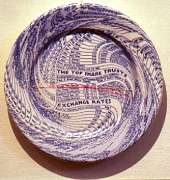
More
overtly-politicised confrontation is increasingly
encountered on plates. The word/image combination which
decorates commemorative plates is now used to redirect
attention to the plate's functional role in works
presenting a critique of consumer society at its most
literal. Both Paul Scott and Conrad Atkinson have used
allusive imagery and judicious continuations of scripted
and printed words as reminders of Third World famine,
Western self-indulgence and the implication of the
consumer in the conditions and actions of countries
which export the produce we eat. Serving up such
unappetising truths on a plate, brings them home in the
most direct manner.
The
dinner-plate is now an arena for life or death drama
where carnivores may dice with the by-products of
government negligence and agriculture's impoverished
ethics. 'BSE, 'CJD' and 'E. Coli' could be inscribed on
many a plate but Karen Densham merely impresses the word
'MAD' in wobbly letters under the image of an equally
unsteady bovine. Densham's Mad Cow (1995) belongs
to a series based on the traditional Staffordshire cow
creamer, and with the word 'mad' the traditional image
is confronted with a topical reality. Three other pieces
bear the words 'fat', 'silly' and 'old' which prefix
familiar insults. juxtaposed with allusions to one of
the best-loved and most cozily collectible items of
pottery, these epithets highlight the disparity between
sentimentalised idea and misogynistic idiom. Densham can
say a great deal using a single word conjoined with the
representation and actuality of essentially functional
ceramic form.
In
considering the potential of word/ceramic continuations
to challenge complacent convention and Influence ideas
we need only think back to 1917, when Duchamp exhibited
his Fountain - a mass-produced porcelain urinal. This
demonstrated the Iconoclastic potency of combining a
functional ceramic with just one word (and an Initial) -
'K. Mutt'. By replacing the printed name of the
manufacturer with this signature, Duchamp identified the
urinal as an art work. Devoid of any aesthetic quality
and emblazoned with a word which seemed to compound
Duchamp's insolence, ('mutt' was colloquial English for
'fool') Fountain presented the idea as the focus of
interest. Fountain remains one of the most revolutionary
and Influential works in the canon of modern art. More
than any of Duchamp's other 'ready-mades' it anticipated
both the Pop and Conceptual movements and the subsequent
relentless expansion of words into visual art, as ideas
displaced aesthetics. For much of the 20th century,
the word has been censored in studio ceramics, but
contemporary practitioners are now claiming back ancient
territory and adapting it to the creative Imperatives of
today. Though some may share Duchamp's iconoclasm, their
motivations are exceptionally varied in re-examining the
relationship between the matter of clay and the meaning
of words.
@ Dr
Stephanie Brown 1998.
1)
As late as 1991 a survey of contemporary international
crafts which illustrated an eclectic range of innovatory
studio ceramics included only one example of decoration
with words (Yo by Adrian Saxe, USA). See Martina
Margetts (Ed.), International Crafts, London, 1991, pp
18-51.
2) In America, where craft
and fine art practices have been more integrated, words
have been far more common in ceramics from the Pop era
on. Robert Engle, Les Lawrence and Jim Melchert are
amongst those making notable works, but Robert Arneson
consistently explored word/clay meanings in sculptural
ceramics from the early 60s to the early 90s. Arneson
pioneered many of the approaches which now preoccupy
contemporary ceramists, including using imprinted and
graffitied words in visual and verbal puns,
investigations of ambiguity and paradox in materials and
artistic activity itself, commentary on 'tasteful' and
industrial ceramics, scatological statements,
politically campaigning and subversive texts.
3 Ivor Robinson, 'The
Book: comparative forms and creative acts', Les Bicknell
(Ed.), The Book as Art, Essex University, 1994, up.
4 The Davis Dyslexia
Programme, devised in the USA in 1982, has a 97% success
rate. See 'Rewriting the alphabet in clay', The
Independent (Education supplement), 16 July 1998, pp
4-5.
5 Lee Nordness, Objects
USA, New York, 1970, u.p.
6 and 7. See Paul Scott,
Ceramics and Print, A&C Black 1994. pages 34, 99.
8 See Hot off the Press
,Paul Scott, Terry Bennett. Bellew 1996 page 30
9 Words in this case are
used for decoration or simulation without regard for
meaning, and may range from adaptations of the
calligraphic arabesques on Hispano-moresque pottery, to
pastiches of 17th century slipware. |